Identity
Branding — Mauva
Effortless sophistication — a mark built on what it leaves out.
- Role
- Brand & Identity Designer
- Year
- 2022
- Client
- Mauva — clothing brand

Overview
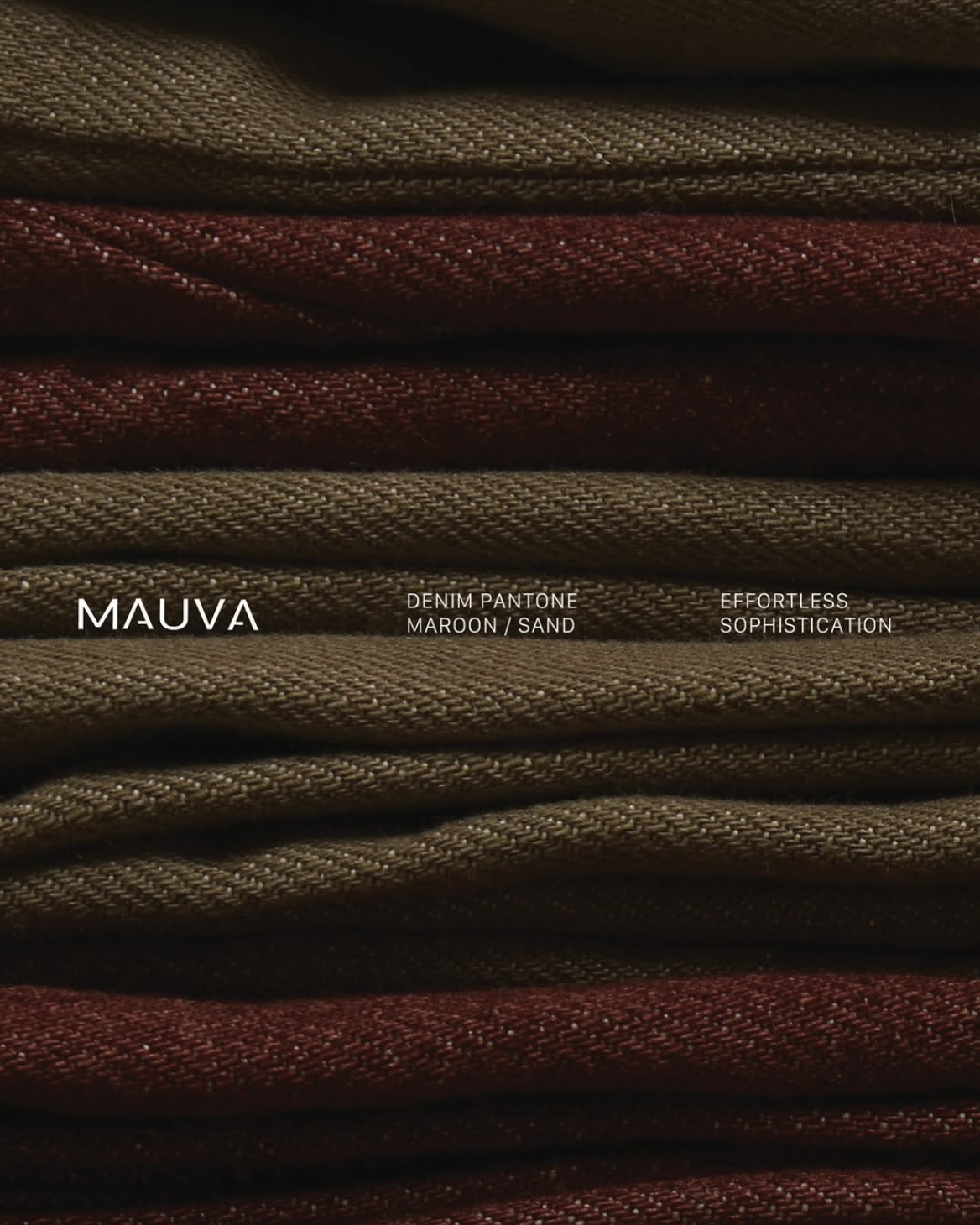
Mauva is a clothing brand characterised by its minimalist aesthetic and refined design philosophy. The identity revolves around elegant simplicity — clean lines and thoughtful negative space.
Step 01
Brand analysis
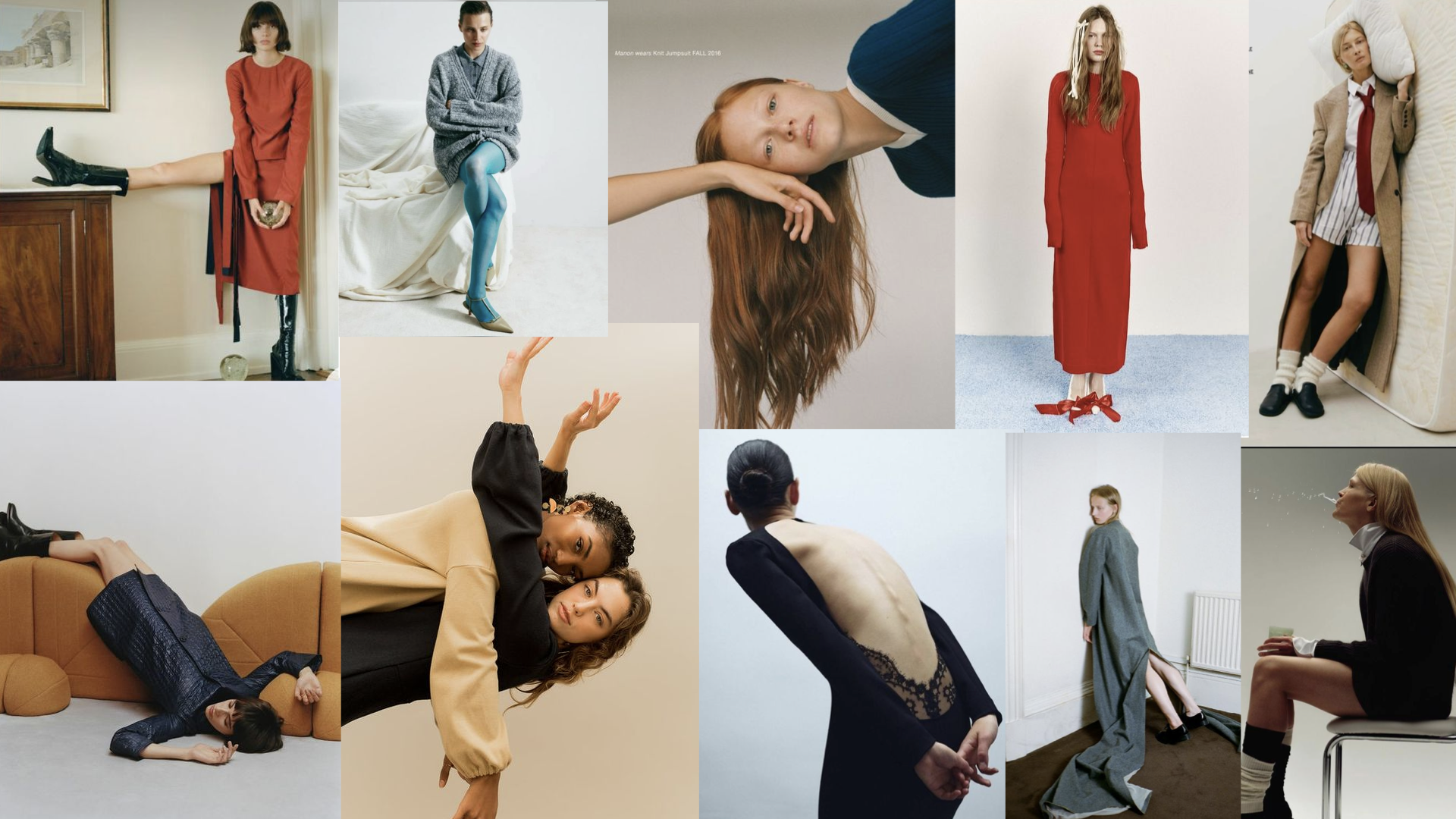
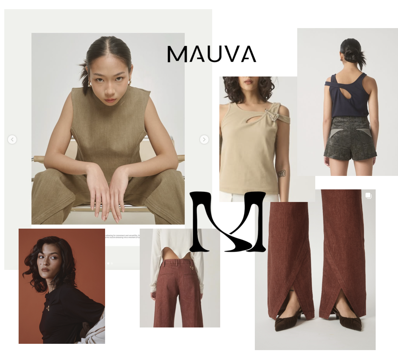
Philosophy: effortless sophistication. Clothing style: a simple overall look with one single twist — a subtraction, an intersection, or an overlap. Persona: a working woman in her thirties — responsible, confident, practical. These are the results that arrived after a few discussions with the owner. The designer then provided me with a mood board of how she sees the brand:
Step 02
Defining audience perception
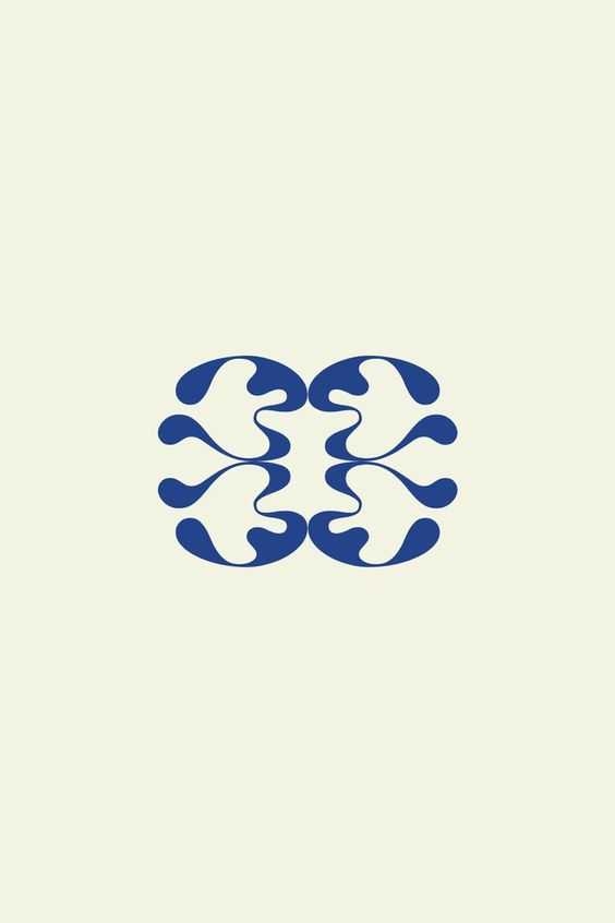
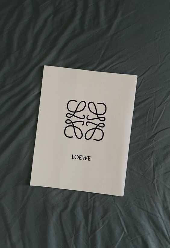
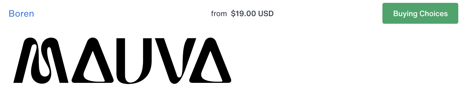
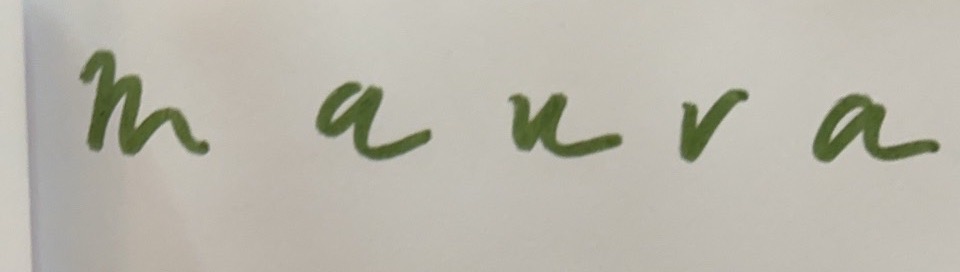
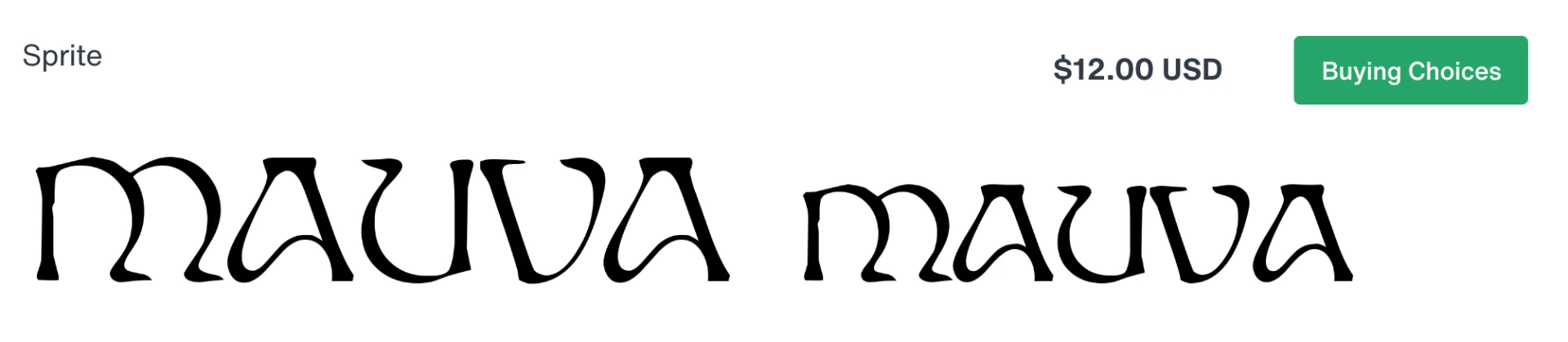
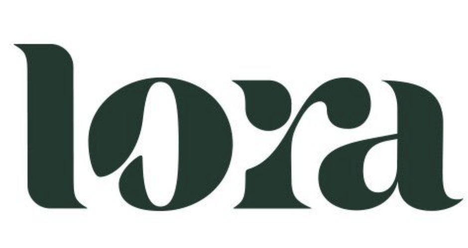
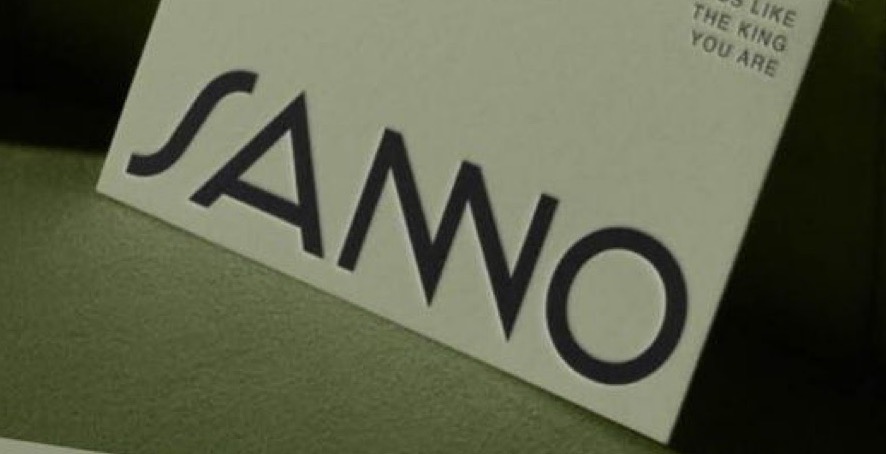
We set the feelings the identity had to produce before drawing anything: soft, empowered, confident but modest, different, special. We shared a lot of logo references to align the brand direction.



Step 03
Schematic designs with intentions
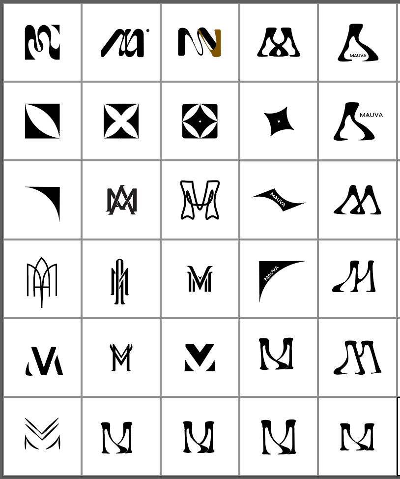
Every sketch was driven by an explicit intention: layering, curvy shapes, the letter M, femininity, abundance, timelessness, and the silhouette of the clothes.
Step 04
Resolving the mark
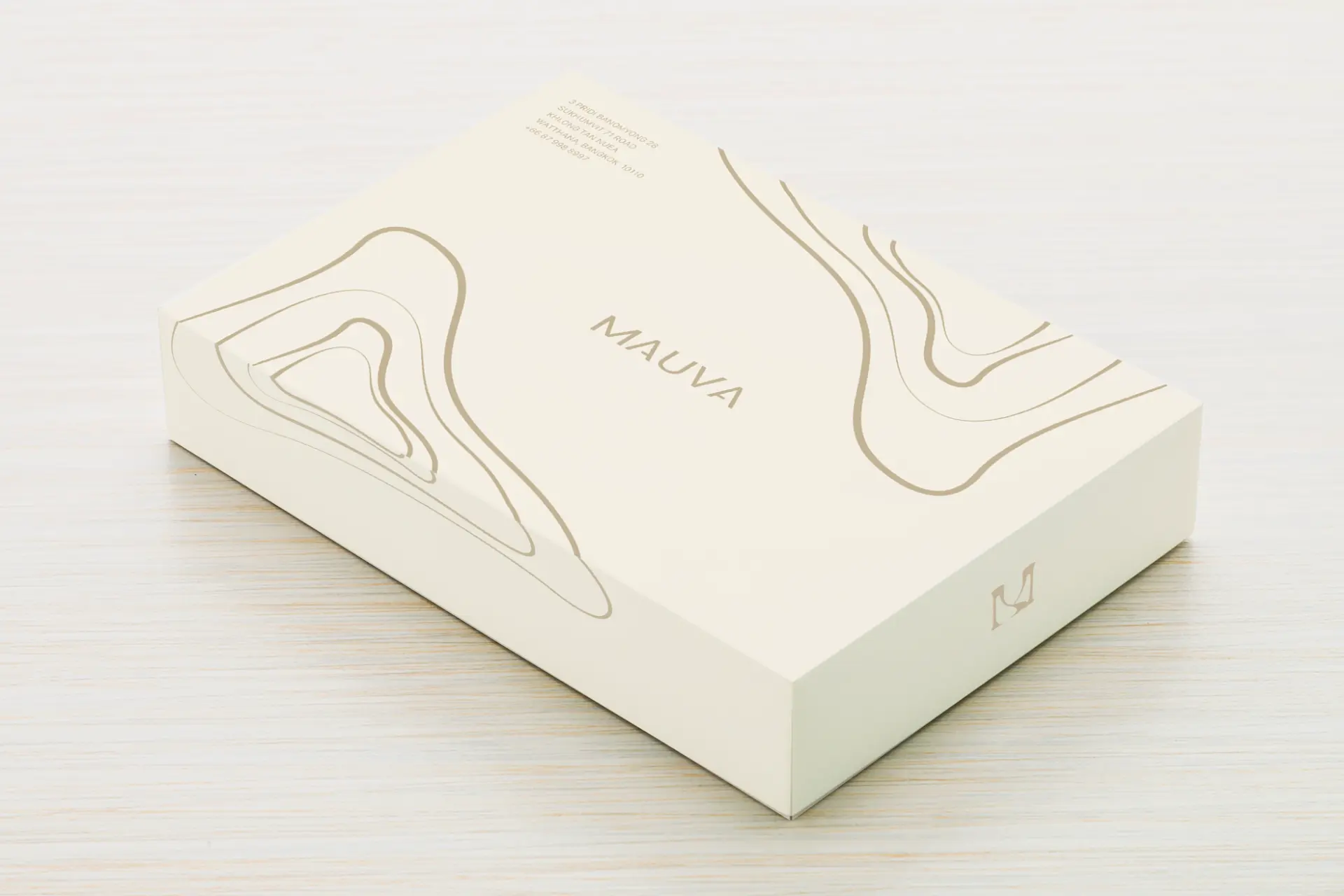
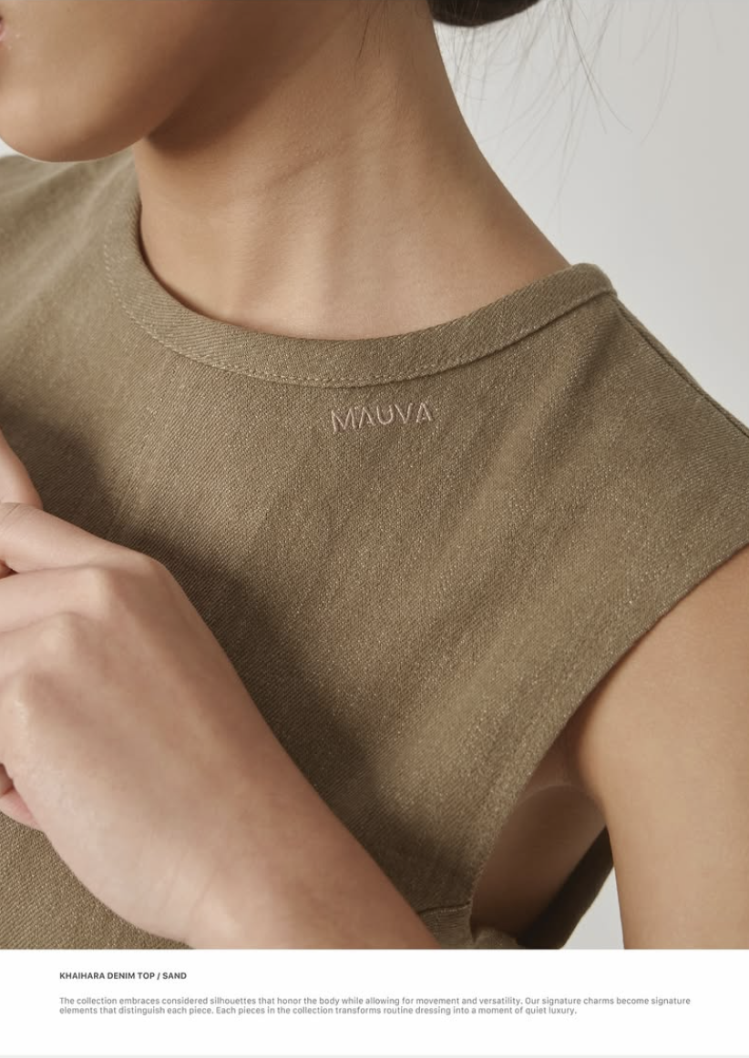
The logo embodies their spirit through a restrained typographic approach: a classic, unembellished typeface with subtle cutout elements that mirror the signature detail of the clothing itself — simple, precise openings that reveal glimpses of skin. The result is a sophisticated tension between presence and absence, covered and revealed: a subtle sensuality that defines both the visual identity and the fashion pieces. Timeless and versatile, it emphasises the wearer rather than overwhelming them.

Challenges
Minimalism leaves nowhere to hide: with almost no ornament, the identity had to carry sensuality and restraint at once, in a single gesture.
Outcome
A timeless, versatile identity where the logo and the clothing share one design language — openings that reveal just enough.
Reflection
Working this quietly taught me that negative space is a design decision, not leftover room — what is removed can say more than what is added.
Next project