Identity
Branding — Taprod
One brand system across an app, a pitch deck, and three countries.
- Role
- Art Director & Marketing Manager
- Year
- 2019 — 2025
- Client
- TaProd — Thailand, Vietnam, Asia
Overview
TaProd is a film production house with three branches across Asia. As the business charged forward — entering new markets, expanding globally — the brand had to grow with it: resonating with new audiences while keeping the loyalty of current clients. I wrote and art directed the TAPROD Brand Book (2023), a single identity system used internally and externally across the whole organisation, and applied it to everything a client would see: the app, the treatments used to pitch commercial concepts, print and campaign work.
Step 01
Logo specifics
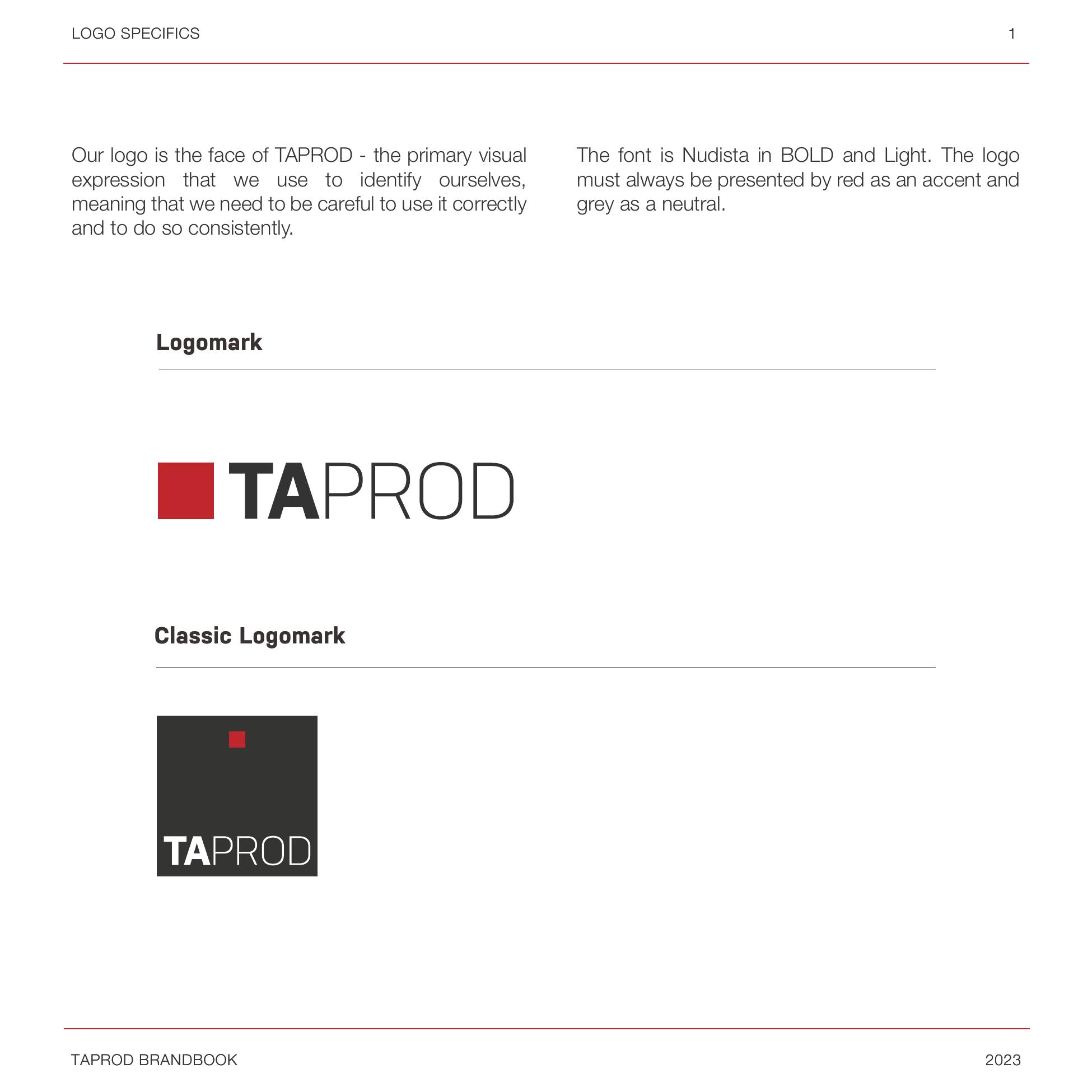
The logo is the face of TaProd — the primary visual expression we use to identify ourselves, so it has to be used correctly and consistently. It is set in Nudista Bold and Light: bold for the 'TA', light for the 'PROD'. It is always presented with red as the accent and grey as the neutral, in both the primary and the classic logomark.
Step 02
Clear space
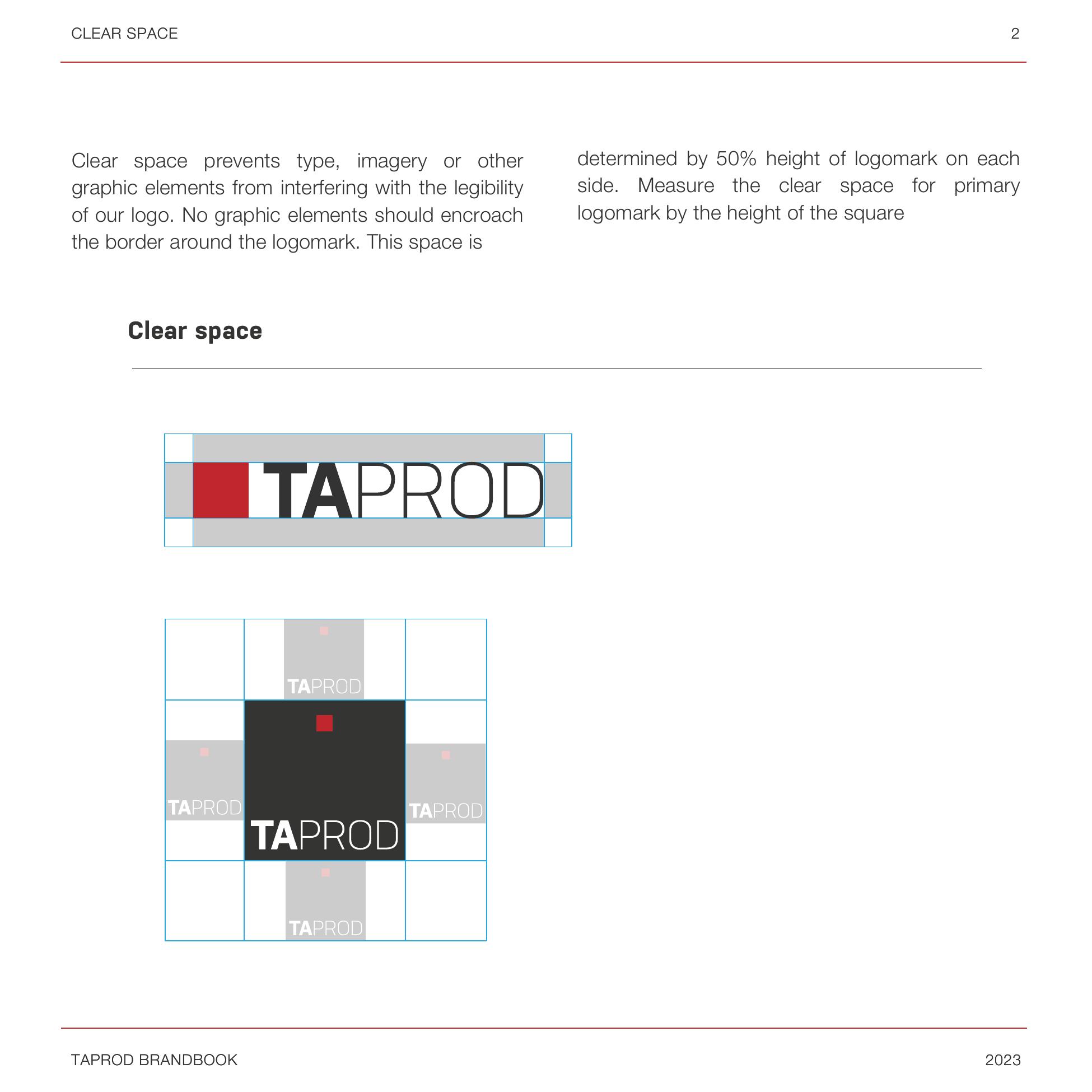
Clear space keeps type, imagery and other graphic elements from interfering with the legibility of the mark. Nothing may encroach the border around the logomark: the space is set at 50% of the logomark height on each side, measured by the height of the square.
Step 03
Logo variations
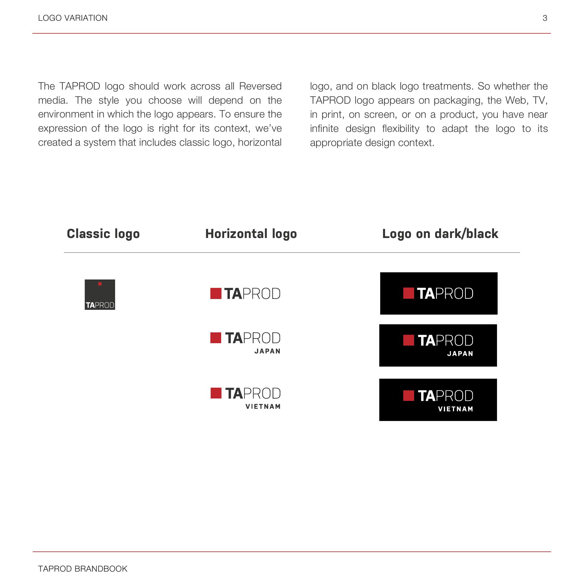
The logo has to work across all media, so the system includes a classic logo, a horizontal logo and an on-dark treatment, plus country lock-ups for TAPROD JAPAN and TAPROD VIETNAM. Whether the mark appears on packaging, the web, TV, in print, on screen or on a product, there is a correct version for the context.
Step 04
The colour system
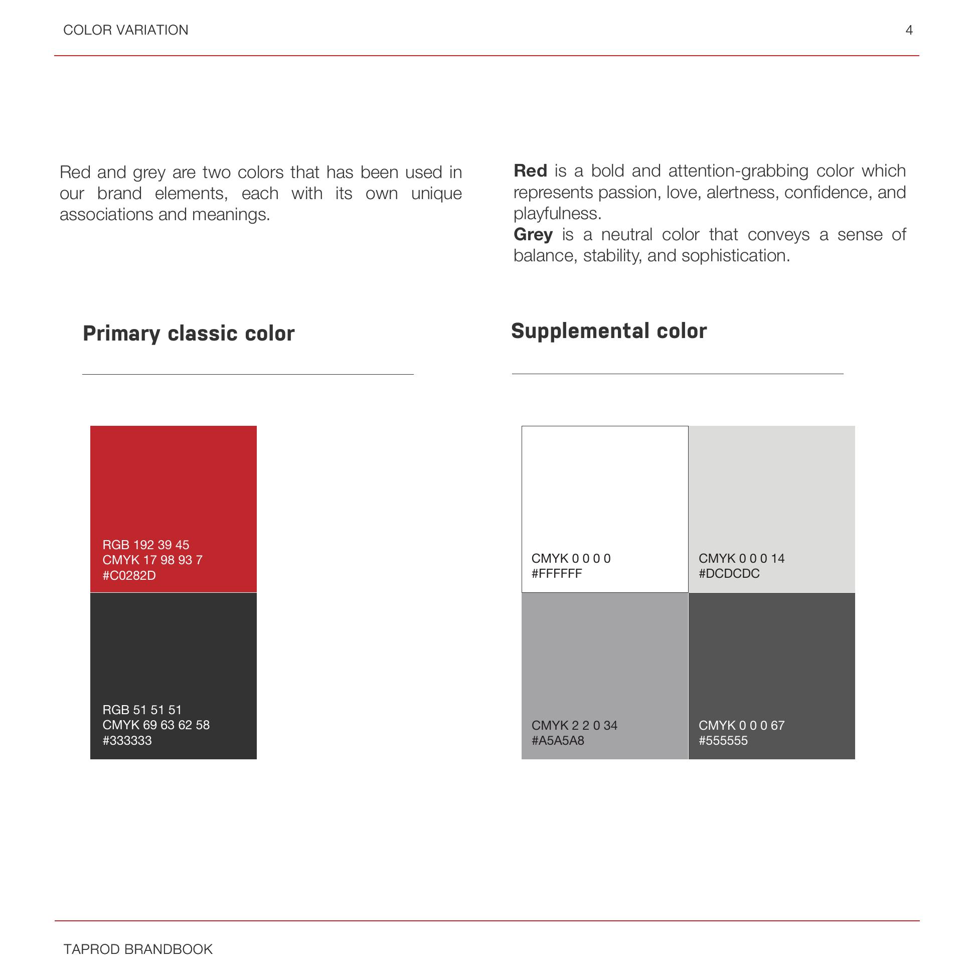
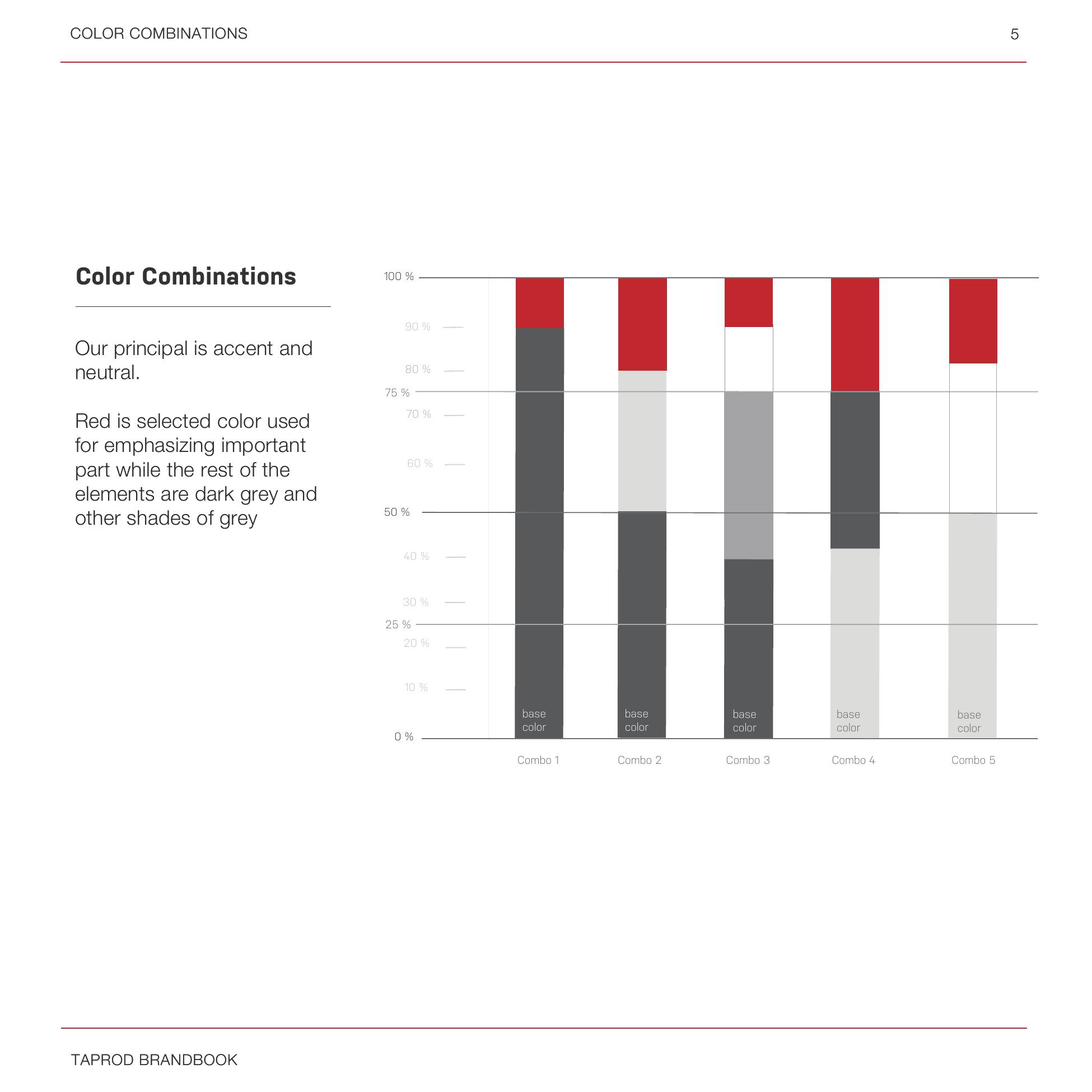
Red carries passion, alertness, confidence and playfulness; grey carries balance, stability and sophistication. The principle is accent and neutral: red emphasises the important part, everything else stays in shades of grey — and in the app it is never used for confirmation actions, so it keeps its weight. Defined red / grey / white ratios set how far the accent can go in each combination.
Step 05
Typography in use
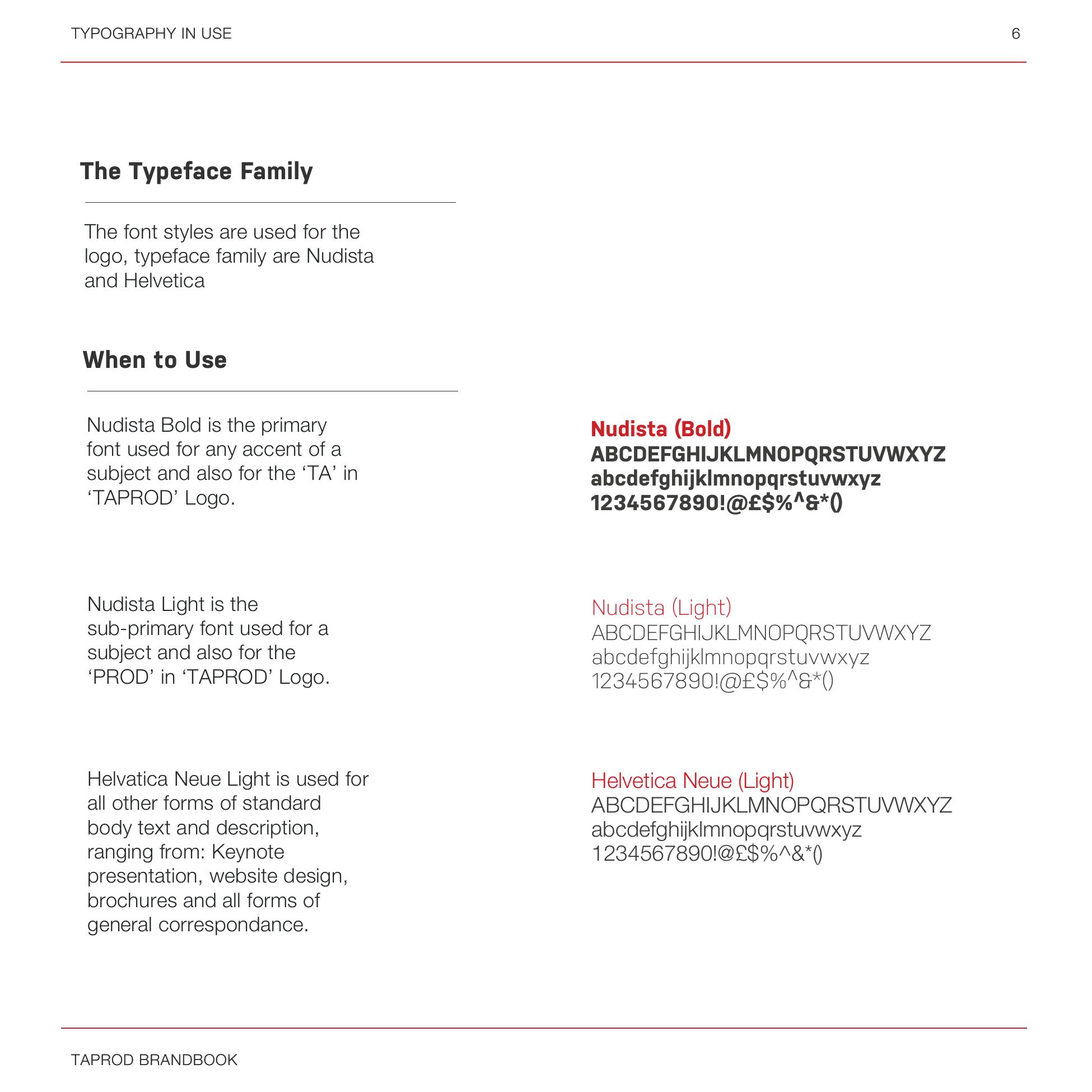
The typeface family is Nudista and Helvetica. Nudista Bold is the primary font for any accent of a subject and for the 'TA' in the logo; Nudista Light is the sub-primary for subjects and the 'PROD'. Helvetica Neue Light carries all standard body text and description — keynote presentations, website design, brochures and general correspondence.
Step 06
Incorrect use
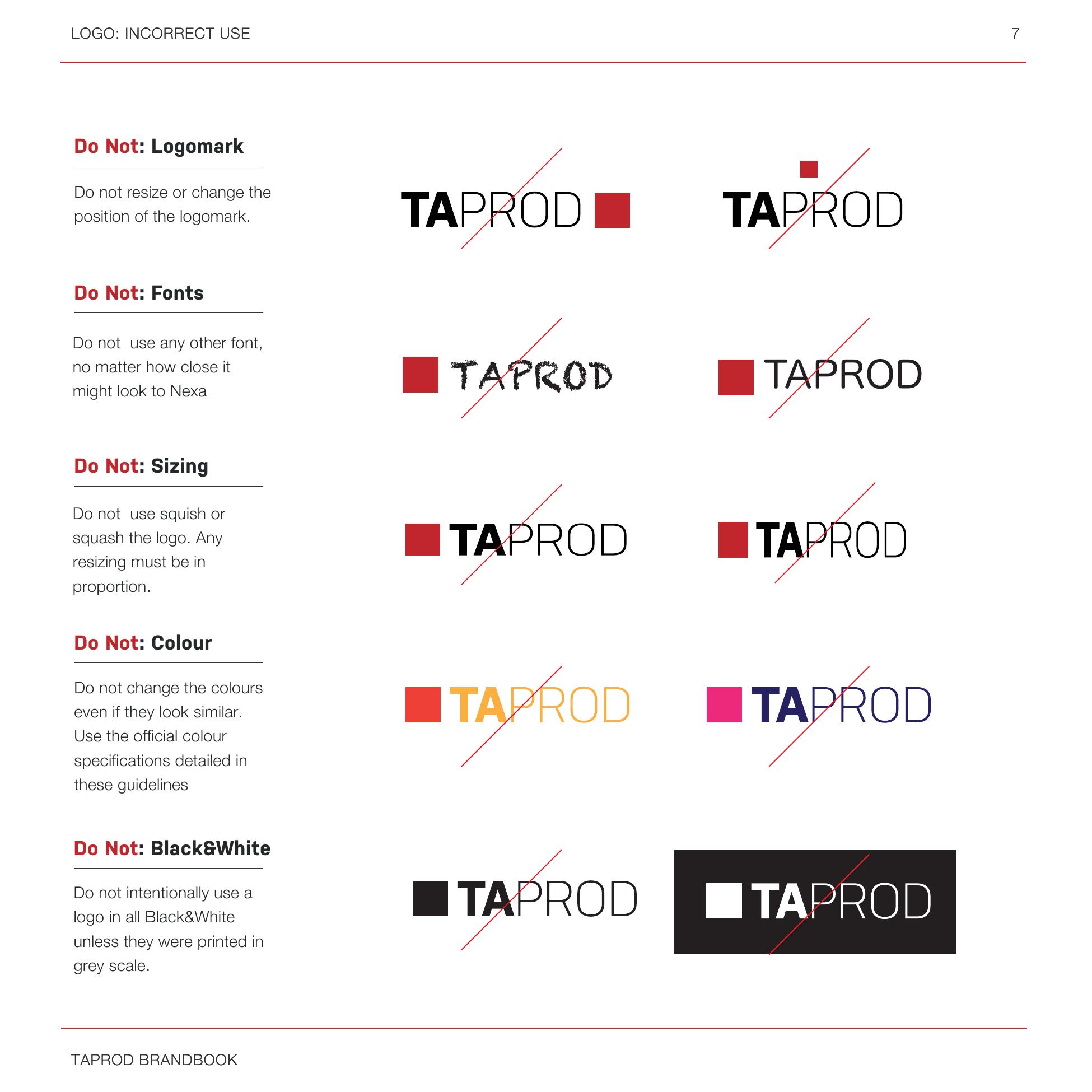
A system is only as strong as its limits. Do not resize or reposition the logomark, do not substitute the fonts no matter how close they look, do not squish or squash the logo — any resizing must stay in proportion — do not change the colours even if they look similar, and do not use the logo in black and white unless it is printed in greyscale.
Step 07
Stationery
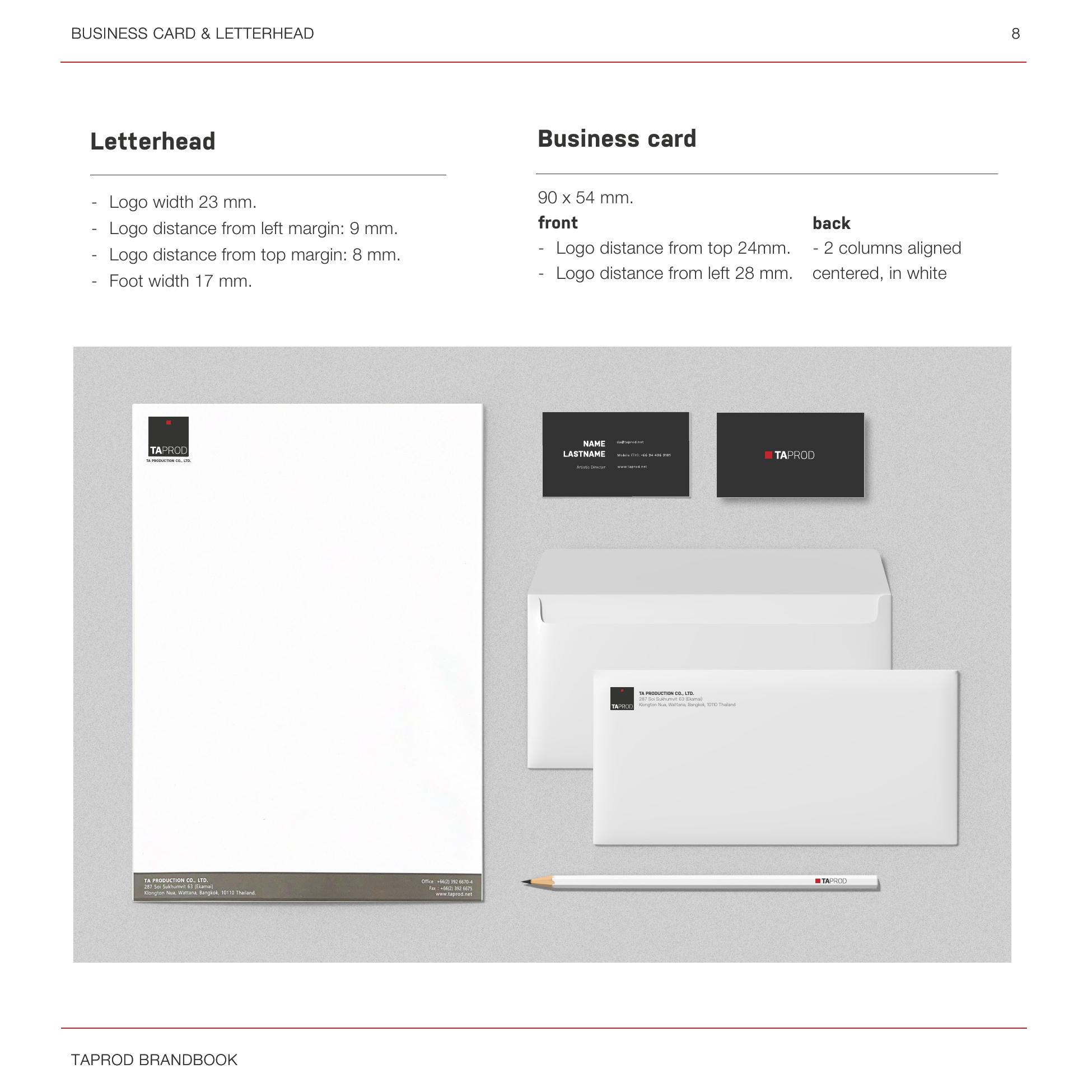
Letterhead: logo 23 mm wide, 9 mm from the left margin, 8 mm from the top, with a 17 mm foot. Business card 90 × 54 mm — front with the logo 24 mm from the top and 28 mm from the left, back set in two aligned columns, centred, in white.
Step 08
Corporate gifts
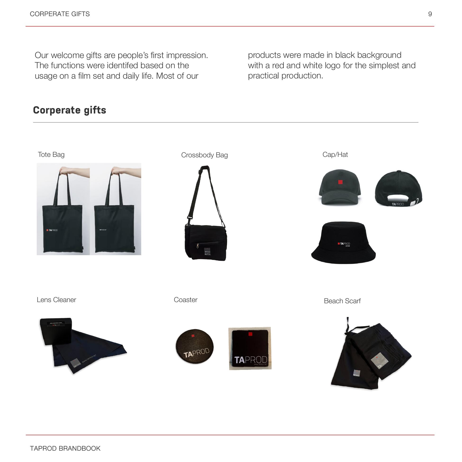
Welcome gifts are people's first impression, so the functions were chosen for how they are actually used — on a film set and in daily life: tote bag, crossbody bag, cap, lens cleaner, coaster, beach scarf. Most were produced on a black background with a red and white logo, for the simplest and most practical production.
Challenges
Three branches, many freelancers and fast pitch deadlines — the system had to be strict enough to stay recognisable and loose enough to be used under pressure.
Outcome
A single brand language running from the app interface to the treatments that won client pitches.
Reflection
Owning both art direction and marketing showed me how much of a brand's strength is discipline — deciding where a colour is not allowed to go.
Next project