Identity
Branding — Yellow
Bringing back a brand's original yellow, and its credibility with it.
- Role
- Graphic Designer
- Year
- 2021
- Client
- Yellow Malta
Overview
Yellow Malta's owner came with a clear business problem rather than a design one: old customers had drifted away and new ones were not arriving. The identity had diluted over the years — including the yellow the brand was named after.
Step 01
Going back to the original yellow
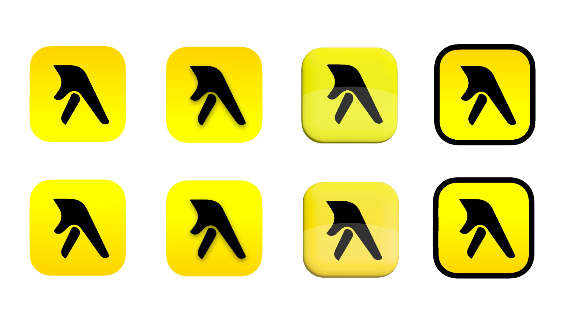
We restored the brand's 100% yellow instead of the muted variants that had crept in, so recognition worked again for customers who remembered the old shopfront.
Step 02
Redrawing the mark
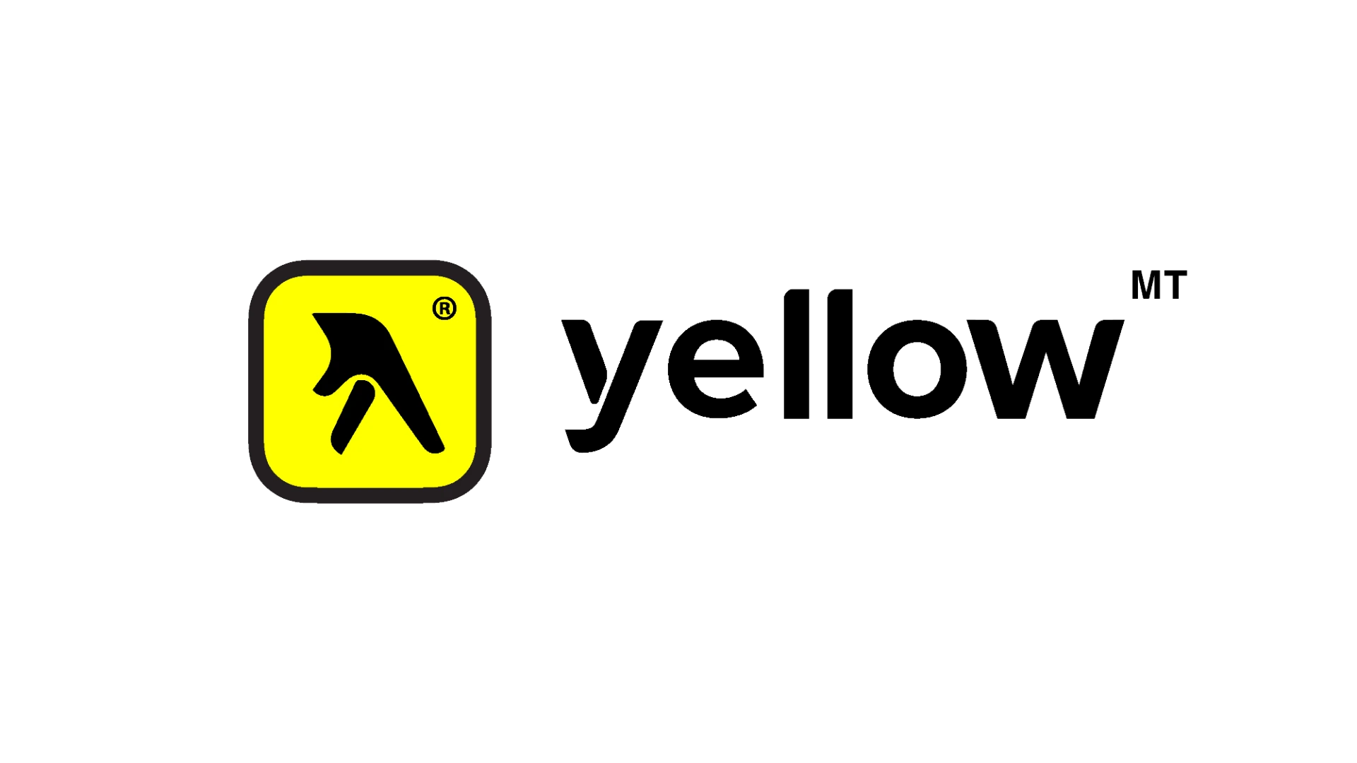
I redesigned the logo and icon in solid Proximanova with rounded, friendly curves — warm enough to feel approachable, structured enough to read as a professional business.
Step 03
Applying it consistently
The mark was set out across signage, print and digital touchpoints so the same yellow and the same shapes appeared everywhere a customer might meet the brand.









Challenges
The refresh had to feel new to newcomers and familiar to lapsed customers at the same time — a rebrand that could not look like a replacement.
Outcome
A cleaner, warmer identity anchored on the original yellow, giving the owner a mark that reads as trustworthy at shopfront scale and on screen.
Reflection
Sometimes the best move in a rebrand is subtraction and recovery — finding what the brand already owned and giving it back its full strength.
Next project