ART DIRECTION
TaProd App.
Led the production and art direction for a mobile product at TaProd, International Film production collaborating on productions for global brands including LVMH, P&G, Lufthansa, and Delta Air Lines.
- Role
- Art Director & Marketing Manager
- Year
- 2019 — 2024
- Location
- Bangkok / International
Overview
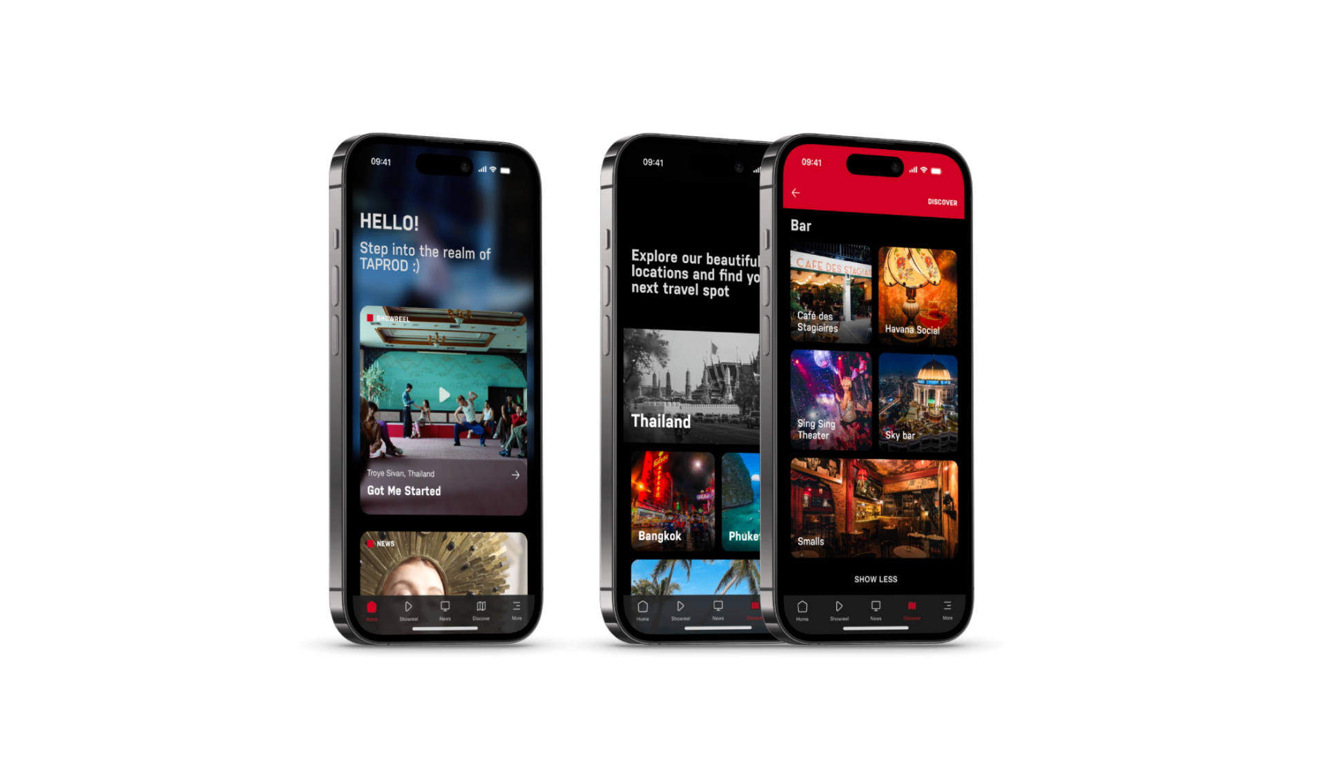
As Art Director of the company, I collaborated with the tech provider to make a unique product that reflects the company's value and presence. We developed the TAPROD App, a specialized digital platform created to serve a film production house with three branches across Asia. The project aimed to reposition our brand and consolidate a fragmented workflow — previously scattered across platforms like Vimeo and Dropbox — into a single, immersive experience. By combining a professional work showcase, interactive city guides, and a collaborative project management tool, we transformed how our clients and teams interact with our production services.
Step 01
Identifying Core Problems
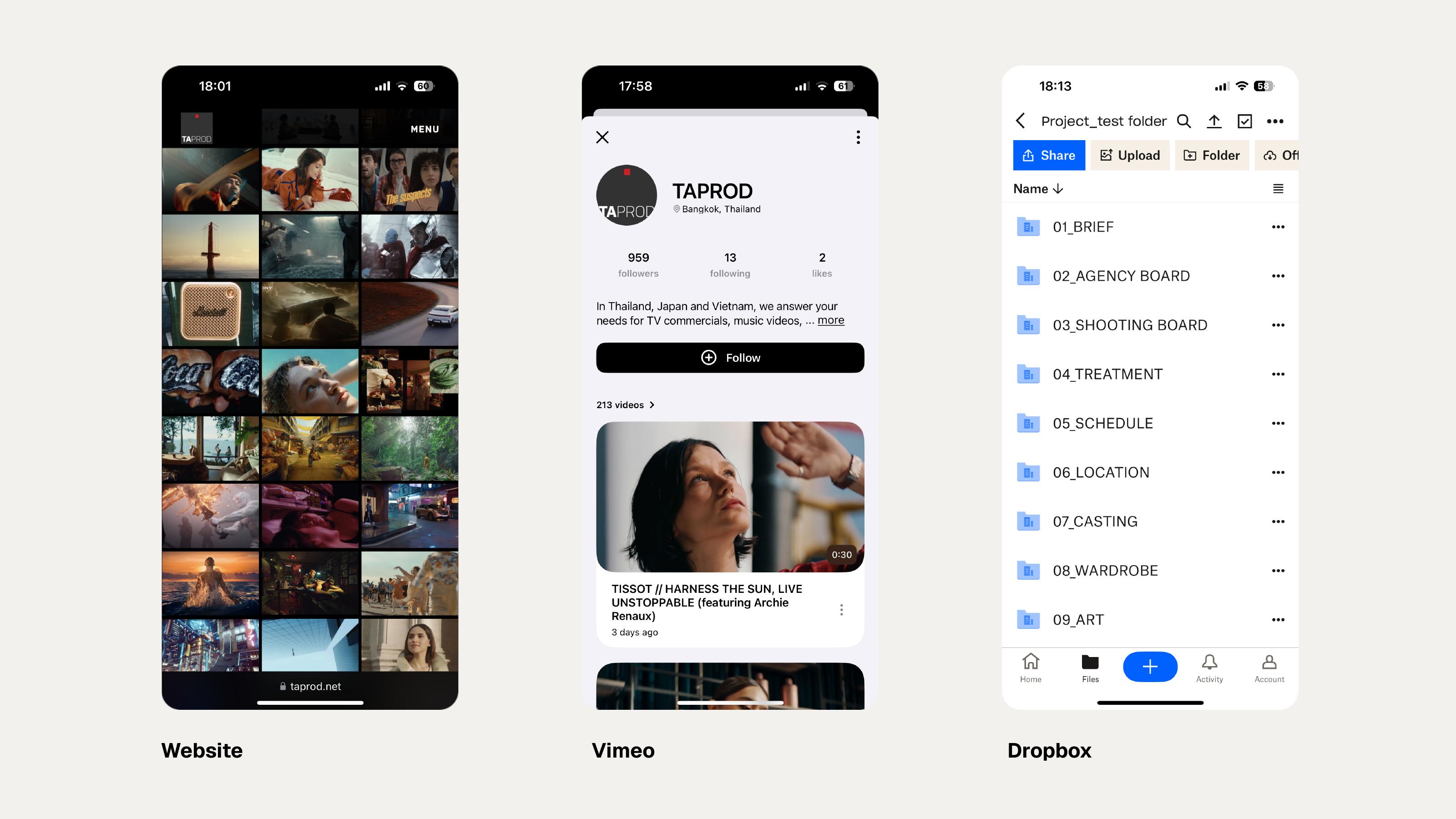
We began by mapping what we actually used every day: the website for the work showcase, Vimeo for reels, Dropbox for production files. Three disconnected platforms meant low engagement and no centralised communication. Important production files were lost in email inboxes or delayed on Dropbox, and our city guide — a PDF booklet needing constant updates — produced no meaningful interaction for international clients.
Step 02
Defining Strategic Goals
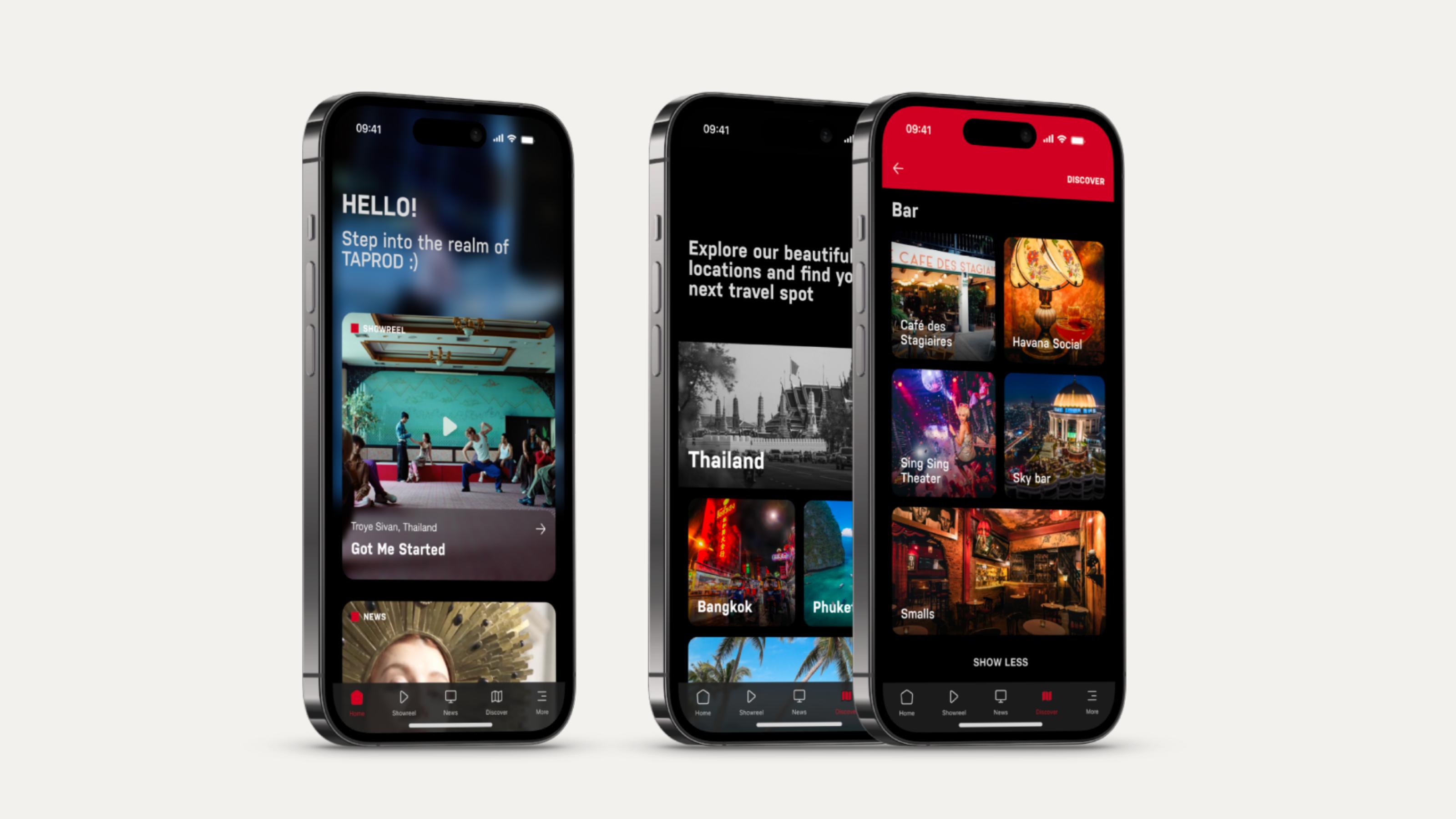
Following our expansion into a three-branch network, we recognized an opportunity to reposition the brand and attract new clients. The goal was an app that served as both a high-end marketing tool and a functional collaboration hub. Each section had to answer a defined user need rather than an aesthetic preference: Showreel, to find relevant projects by product, category and talent; News, for industry insight and company updates; Discover, city guides for international clients unfamiliar with the area; Project, streamlined access to production files.
Step 03
Establishing Design and UX Standards
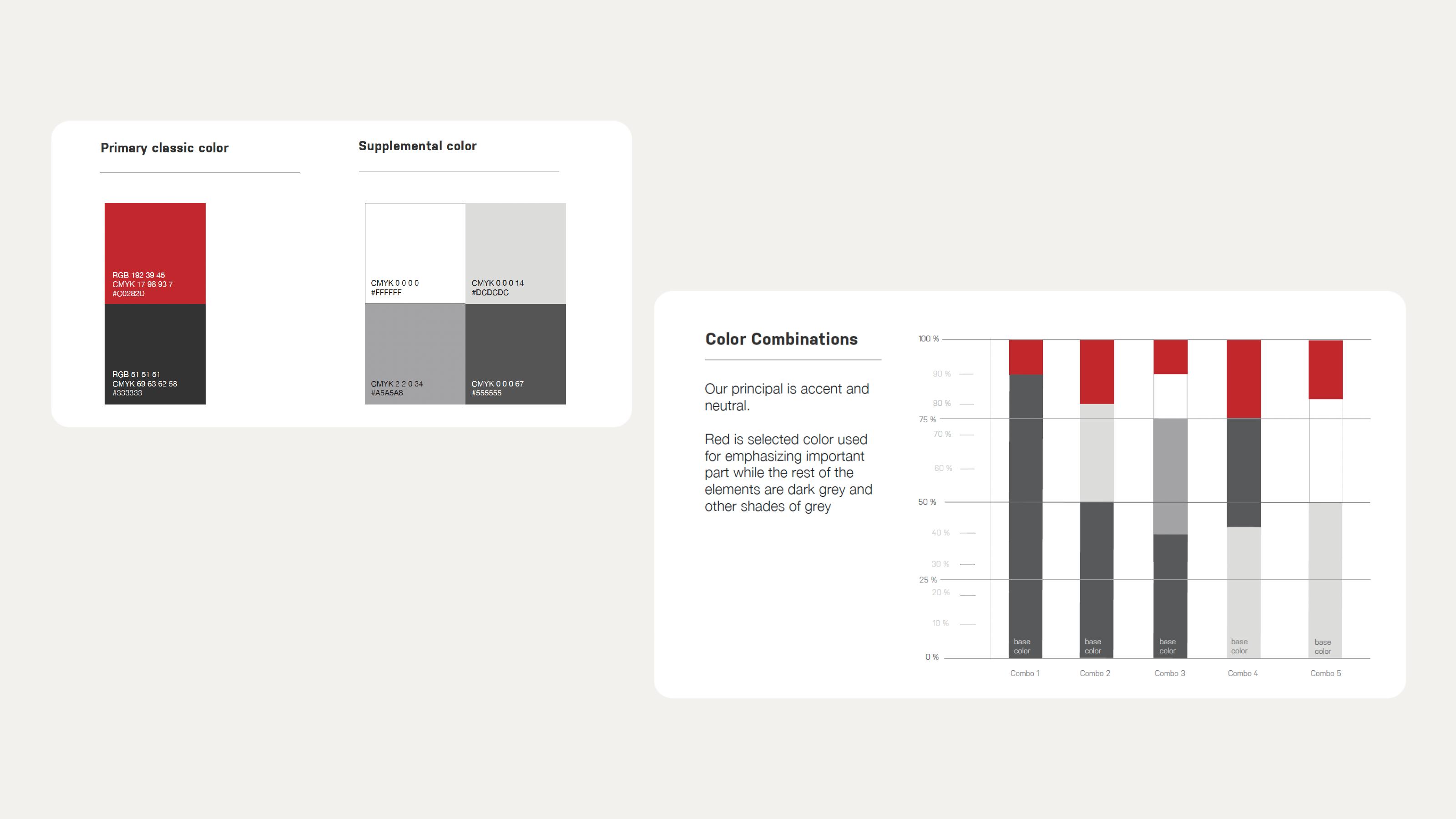
The hardest part was aligning brand identity with UX limitations. Red is our main colour — passion, alertness, confidence, playfulness — but we deliberately kept it off confirmation buttons, where convention and clarity matter more than branding. Grey carried balance, stability and sophistication, and we worked to fixed red / dark grey / light grey ratios so the accent only ever emphasised the one thing that mattered on screen.
Step 04
Developing Integrated Solutions
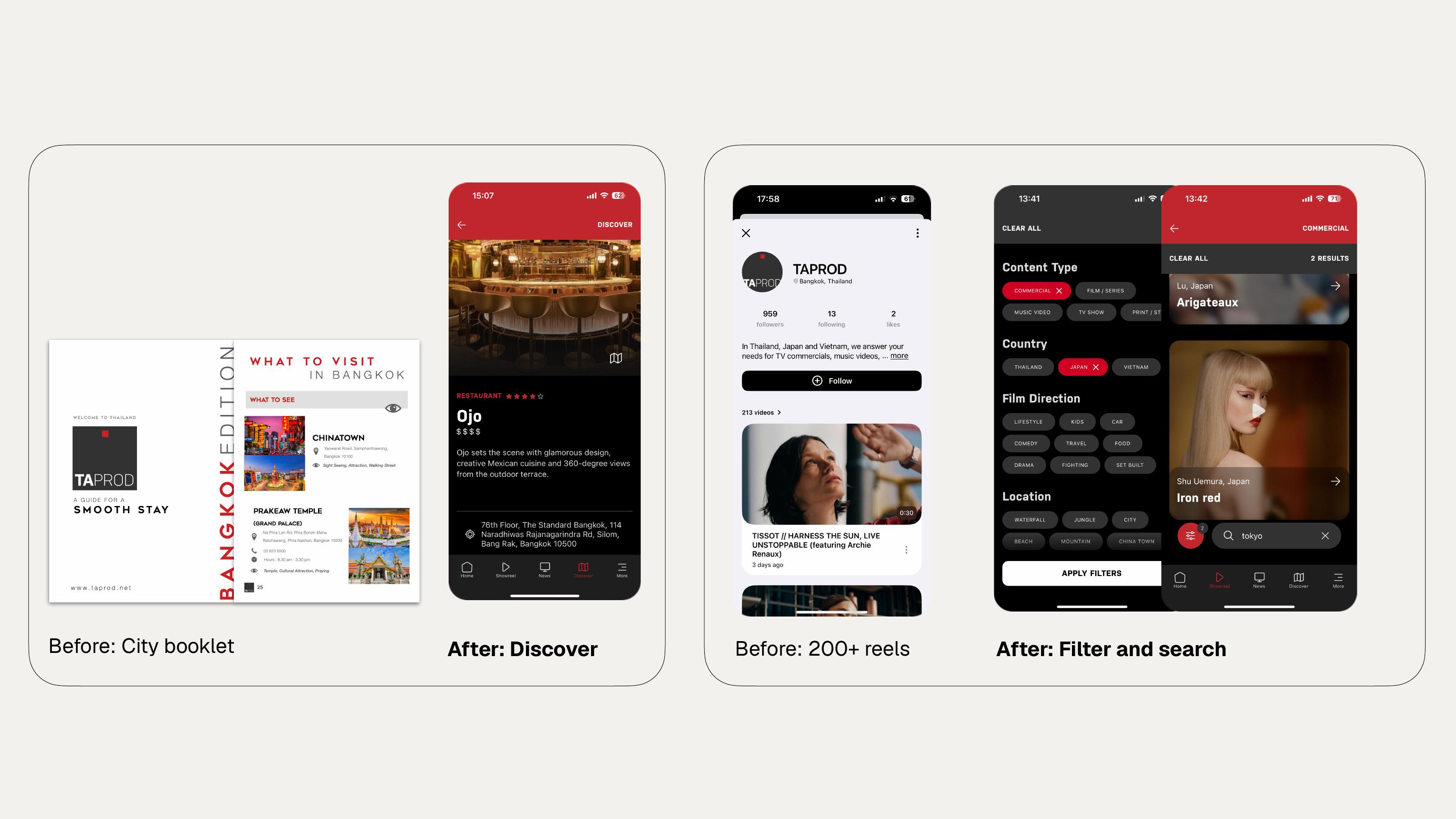
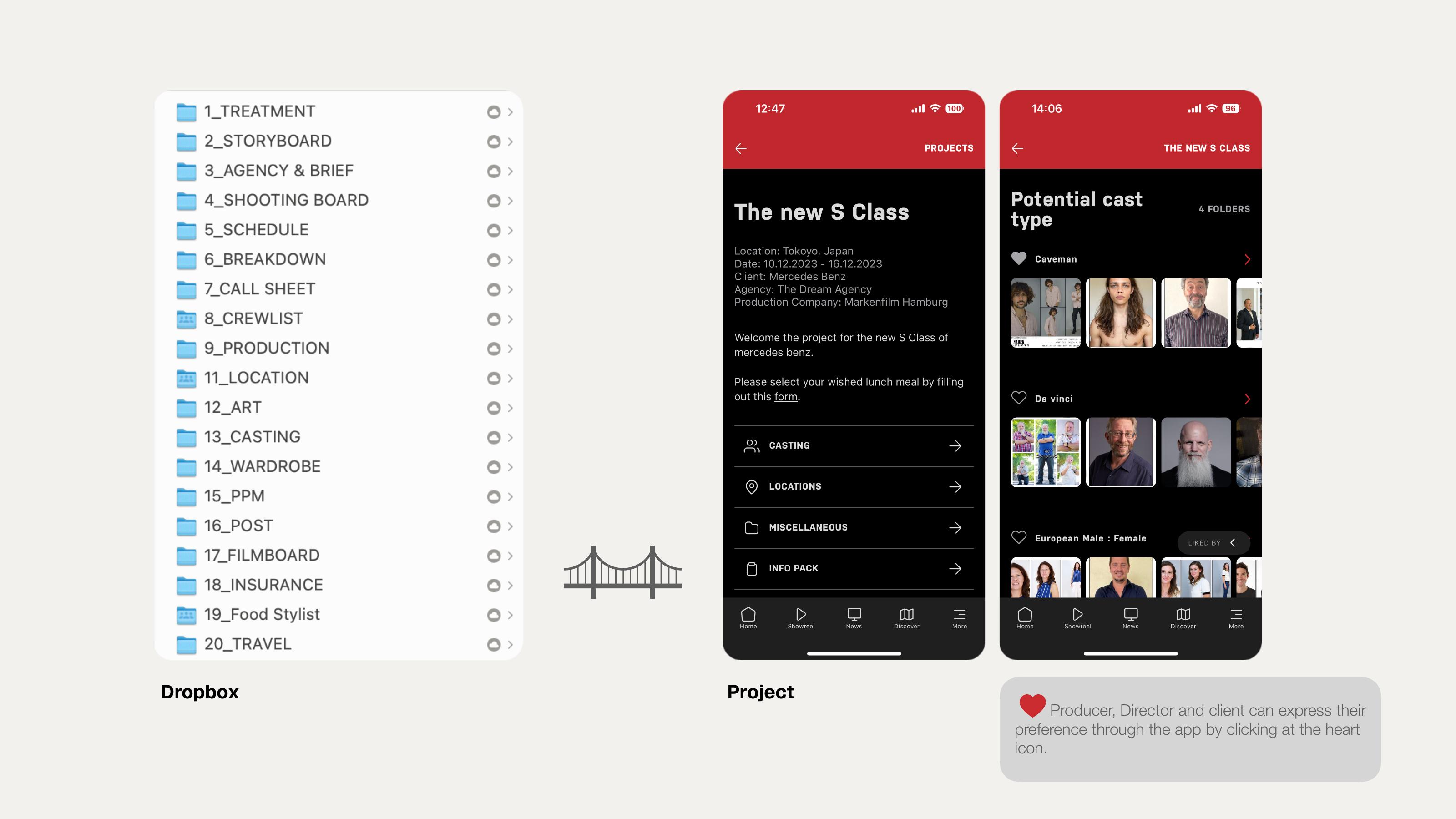
To close the communication and engagement gaps we shipped several key features. Showreel with tags: Each reel was tagged with its relevant jobs so a search returns work, not just video, and filters let clients narrow hundreds of films down by product, category or talent. Booklet transformation: The interactive Discover section replaced the printed city booklet entirely. Files quick access: The Project section was bridged to our existing Dropbox structure — treatment, storyboard, schedule, call sheet, casting, wardrobe, post — so the twenty folders a production really runs on became a readable screen with notifications instead of a file tree. Pre-selection for team: A heart icon let directors, producers and clients mark preferred reels or potential cast in a tap, rather than working through files on Dropbox.
Step 05
Evaluation and Key Takeaways
The final app significantly enhanced the company's professional image and earned positive feedback from industry peers. We also identified areas for future improvement: the mandatory login process can disrupt typical user behavior patterns, and because content is easily available on social media and Vimeo, the app must continue to provide unique value to justify the extra steps required to use it.
Challenges
Consolidating a workflow scattered across Vimeo, Dropbox and email into a single branded platform — while balancing a bold visual identity with UX conventions the industry already trusts.
Outcome
A shipped iOS product used across three Asian branches: Showreel, News, Discover and Project sections, interactive city guides, direct-to-Dropbox project access, and a heart-based feedback system for reels and cast.
Reflection
Art direction here meant designing an experience across time and touchpoints — the interface, the notifications, the small feedback loops.
Next project